

Fresh look, same great spirit
New bottles, new labels – with the same great Colorado spirits on the inside.
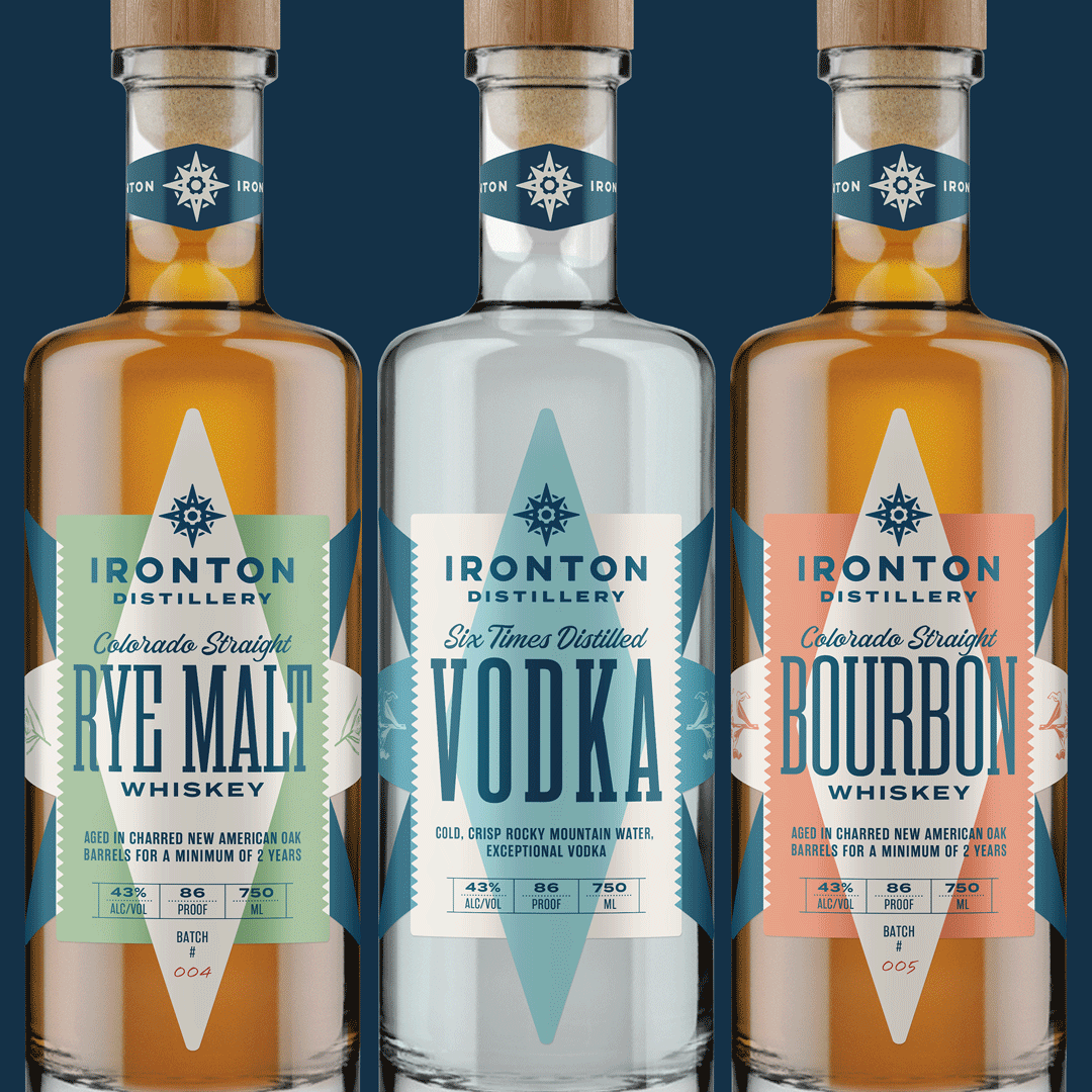
We wanted our outer spirit to match our inner spirit.
Approachable spirits made and enjoyed the Colorado way.
A quote from our designers - Cultivator Advertising:
Ironton wanted their labels to be dynamic but friendly, simple but not boring. The current system was a bit too serious and didn’t showcase the down to earth, adventurous, fun and inviting nature of the distillery. So, we started with the established Ironton identity, which encapsulates those qualities, and used the compass star as the foundation for the label. By use of a simple color palette, bold shapes and thoughtful typography, the labels find the balance between refined and approachable. Like Ironton’s spirits, this packaging is equally at home as an elegant addition to the liquor cabinet as it is beside the river on a day of fishing.
Keep an eye out for our new bottles hitting shelves this September and raise a glass to shared spirits!